Did you pick the wrong color paint? It happens, all the time actually...even to seasoned painters.
Here are 3 things you can do to fix it when you choose the wrong color to make it right and get the room of your dreams.
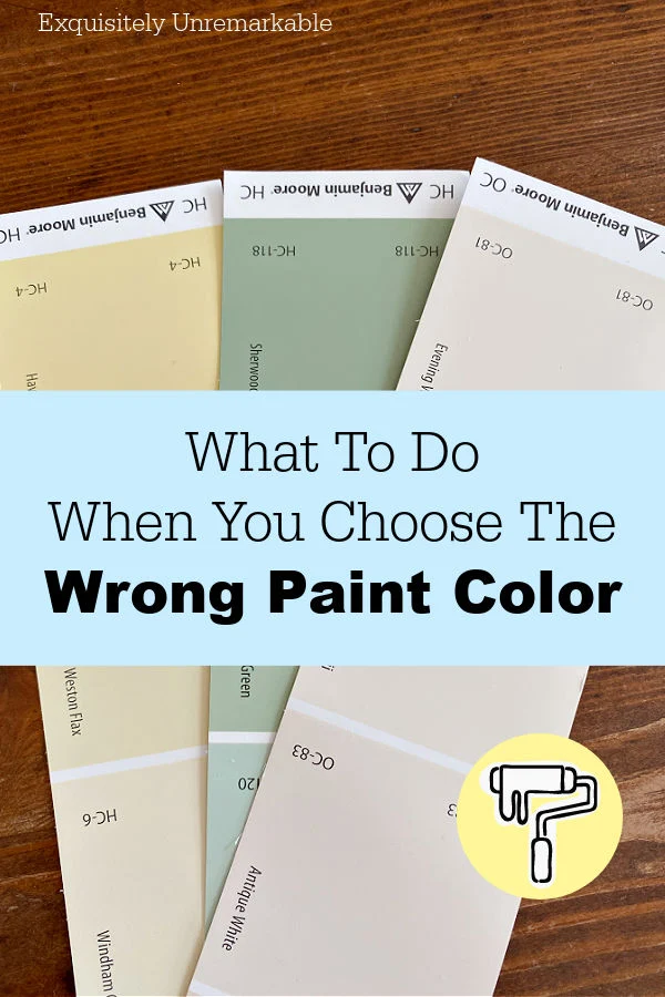
We walked out of the paint store with several cans, ready to attack the ceilings, the trim and, most importantly, the walls.
Since that's where the big changes would be happening.
Replacing a dark and moody Monroe Bisque with a creamy, light and bright Windham Cream.
From winter soup to spring confection.
A super easy swap.
Or so I thought.
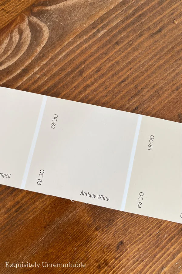
Originally, I wanted to paint the hallway the same color as the kitchen, Antique White.
I knew the color well, loved it and thought it would be a great palette cleanse in the hall.
However, my husband wasn't convinced. He wanted something with a little more color.
Something closer to the living room paint, and he wasn't wrong, that would work, too.
And it was our anniversary, a time for joy and to celebrate our 28 years of partnership and compromise.
So I said, sure, let's give it a try.
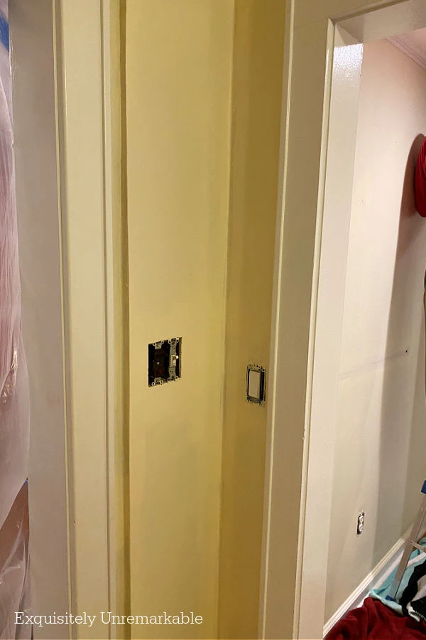
Well, so much for letting emotion dictate decorating choices, because as soon as that first coat was on, we both knew it was a major fail.
Too yellow, too cold and just plain wrong.
It was very disappointing.
So what do you do when you pick the wrong color paint?
Well, in my opinion, you have three choices.
1. Sit With It For A Bit
I know, this is hard to do.You don't want to wait, you want the job finished and you don't want to clean up and add accessories only to have to remove them all again to repaint.
But sometimes, a little time is all you need.
When we painted my bedroom, I knew I wanted a bright green. Something with a deep, rich, soothing tone and maybe a little bit of brightness for my sun filled master.
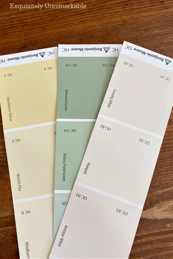
My choice was Benjamin Moore Sherwood Green. The swatch was perfect.
However, when it went on the wall, it looked like a grade school chalkboard.
And I hated it.
My gut feeling was to paint over it immediately, but, I decided to wait. I gave the walls a full 24 hours to dry and settle so I could see the true color.
It also gave me a chance to watch the room as the light transitioned throughout the day.
That's all it took for me to fall in love.
Once I added accessories, it really looked amazing.
My room is now one of my favorites in the cottage...and after almost 20 years, it's the same shade. And I have no intention of changing it.
2. Bring It Back To Get Color Corrected
Let's face it, whether you DIY or have someone apply it for you, paint is expensive.
And when you've chosen the wrong color, not only do you have to go back and paint again, but you have to pay for the supplies twice.

Now, in general when the color isn't right, it's rare that it's way off. For example, you picked violet, but you want orange instead.
It's usually just a hue away from your dream color.
If that's the case, I suggest bringing the can back to the store and asking them for a little help. Many times, paint can be altered or retinted in a way to make you happy.
It's not foolproof, but it's definitely an option.
I adore the color red, that's no secret around here, but in 2003 when we painted our newly added kitchen, I was new to the hue.
I loved the drama and the warmth I saw in magazines, but I hadn't found my signature tone.
When the time came to cover my floor to ceiling wall, I came home with a can of Benjamin Moore's Barn Red.
And it was all wrong. Too much brown, not enough pop.
I went back with the can and a better idea of what I wanted and, presto changeo, they fixed it.
Of course, that paint doesn't have a name, but the formula is on the can so I can replicate it if I need to.
3. Buy New Paint
The third option here is to admit defeat, know the color isn't right, isn't ever going to be right and start over.Yes, it's expensive, yes, it's a lot of work, but in some cases no amount of time or tint is going to make you happy.
And it's time to go back and get new paint.
We've always been DIYers, however, when we moved in here, I'd started teaching again for the first time since I had babies, my husband was traveling a lot with a new job and we were renovating top to bottom.
To save our sanity, we decided to delegate a few jobs to the pros.
Painting was one of them.
I'd hired a great group of guys to coat every room and over the course of two weeks I think they grew to know my taste.
So I wasn't surprised when one of them called me into the living room to tell me I was going to hate the color I chose. With one roll we could both tell that neon yellow, was not going to cut it.
Ever.
While I did bring the can with me, back to the store, there was no quick fix and I walked out with a fresh can of Philadelphia Cream instead.
Which, by the way, is gorgeous.
And why we chose the Windham Cream for the hall...very similar. On paper.
But guess what?
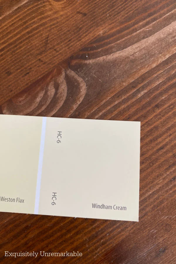
When I looked back at my notes, from long, long ago, it's the very same neon yellow tone that made me shudder in the living room.
It just doesn't like my house.
Live and learn.
The funny thing is no matter how many times you go through this process, no matter how much of a paint expert you consider yourself, until you put that paint on the wall, you just never know.
Lighting, even on different walls in the same room, can drastically manipulate colors, plus swatches are never the same as the actual paint.
And sometimes, what you think you want splashed all over a large space is simply too much.
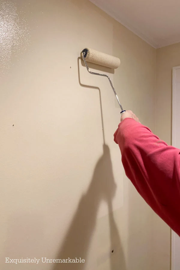
Like in that hallway.
Which in now Antique White.
Just right.
How are you at picking paint colors?


I consider myself great at picking paint colors, however in this house the builder painted for us.
ReplyDeleteWhat I loved in our old house didn't work at all here.
First, we forgot we were downsizing so dome colors didn't work.
Then I forgot the fact it's a ranch with a semi open floor plan
I lived with it for awhile but couldn't take it anymore.
My wonderful husband fixed rooms for me.
I was so mad at myself. What was I thinking?
It's so hard to pick sometimes. I get it. In our old cottage, I was a pastel girl. It was a light, bright, sweet airy home. This one has a heavy stone fireplace and beams on the ceiling. I had to rethink my plans, too...now I'm doing it all over again and it's not easy!!
DeleteIf there will be light going into and out of the room, then I get 10 paper samples of the color and tape them together to make a bigger piece of the color. Smack it on the wall and ck the color throughout the day and evening too. That bigger paper gives you just enough insight into a possible disaster.
ReplyDeleteGreat idea! I usually only grab a few, but I think 10 sounds much more practical to get a true idea. Love that tip, thanks so much!
DeleteKim, I don't remember which company it is but someone offers stick on wall colors in a nice size that you can apply to the wall so you can really see how the color will look.
ReplyDeleteI know that whatever you pick it will look amazing when you're done.
That's so funny...as soon as I hit publish on this post, ads for those sample sheet companies were everywhere in my feed! Thanks for the tip...I may go that way with the next room. And thank you for the sweet comment. I have to say, it's done now and it looks so much better. I can't wait to share!
DeleteI am actually pretty good at picking paint colors, but there have been a few times I needed to repaint. I now buy the huge samplize paint sheets and put on the wall. When I painted the navy in our living room I actually ordered 6 different navies and choose the one we liked the best.
ReplyDeleteI just saw those Samplize paint sheets in an Instagram ad, Penny. So funny, I think Google and Facebook were reading my mind again! I'm working on a plan for the family room now. I might have to pick up a few sheets in green!
DeleteI love all of the paint tips you've shared Kim. I love the antique white and have that color on my basement walls and laundry room. I love the Hawthorne Yellow and have that in my kitchen and my bedroom. I love the historical colors and you can't go wrong with them. As you know I just went through picking out colors for my LR, DR, and halls and bought about 6 small samples cans of paint and placed them all over the house. Doing that was such a big help in making the paint color decisions.
ReplyDeleteI remember your paint picking days, Julie! It’s not easy for sure. It’s so funny how such a tiny hue difference in the can, makes such a huge difference on the wall.
DeleteI'm an Antique White girl....It looks the best with red ;^)
ReplyDeleteCan't wait to see what you are doing!
Blessings,
J
It really does, J! That pairing is such a classic!! Enjoy the day!
DeleteOh, hon! You know I have YELLOW and RED walls. At first, Hubby was very unhappy with them. But they grew on him. And now if I think of changing them he says he wouldn't want to! Quite the turnaround! 🤣 I still love my wild colors. Your colors are always so nice. That yellow might've worked for you, but it's also nice to be sure and go with a safer off white. It's a restful color. And you can always change it again. Easier to cover than, say, red! 😊
ReplyDeleteI love my wild colors, too, Kim...maybe it's the name? Oh and yes, that red is on the wall for the long haul. I think it took him 5 coats to get it just right. No one is interested in doing that again!
DeleteMy husband manages our local hardware store. He gets frustrated with people and paint color issues. However, I remind him how important color is and how hard it can be to get it right. I get samples and put them on the walls to live with the color for a bit. And sometimes I still get it wrong!
ReplyDeleteI like the new color in your hall!
I can only imagine what he must deal with, Mari! It is important to get the right color, although, I'm not the one mixing and remixing on a daily basis!! I can imagine that must be very frustrating.
DeleteWe enjoy working with Benjamin Moore paint too. Great tips regarding what to do if we get our paint color wrong.
ReplyDeleteLOVE Benjamin Moore, Carla...it's my go to paint for so many reasons. I just have to pick the right color first though! Hahaha!
DeleteI've made my share of mistakes, and had lots of wins, too. When we bought our condo in Florida, I knew I wanted white walls. My husband thought we should just go with linen white, which we knew well from another apartment. I knew it would be wrong because of the light here, and as soon as he saw a swatch on the wall, he agreed. My big "win" was a pale blue wall behind our bed in Florida, which makes me smile every time I walk into the room. PS - I think my family room in NJ is Windham Cream, which does look nice in our lighting, but I am tired of it and would love to repaint it with something that has less yellow tones. I'm glad you were able to resolve your paint mistake!
ReplyDeletePale blue on a Florida wall sounds perfect, Amy!! I do love that Windham Cream, I'm obviously always drawn to the swatch when we paint!! I just don't think the lighting our house is quite right for it...luckily Benjamin Moore has a million other colors to choose from. Which is part of the problem!! 🤣
DeleteI live in an apartment and I hate the paint colors! A light beige/taupe and a pale cocoa trim and doors. I don’t do those colors at all or any shade of brown. ☹️ I could repaint but my back refuses to cooperate. 😂 I like color and I have an abundance of it! I’ve heard that painting foam boards and leaving them in the room for awhile helps to see how the color looks. It’s very difficult to choose paint based on the little paint chips. Good luck as you move forward!
ReplyDeleteThanks so much! Yes, I understand your back issues, painting and my lungs don't mix well either! Thank goodness I have a willing accomplice.Of course that means he gets to weigh in on design decisions...which is where the trouble starts!! Thanks for the tip, too!
DeleteI love decorating, Kim, but it takes me forever to pick out paint colors! It’s a big deal to live with walls. I had the major part of inside painted last Spring and I went with the same shade, Benjamin Moore Coastal Fog, because I still loved it and it’s soothing. Thanks for all your tips on what to do with wrong colors.
ReplyDeleteOh, Coastal Fog sounds lovely, Kitty! I have to go look at that color right now!!
DeleteBTW....yellow paint takes weeks to cure. I had no idea. I was so upset when I saw our stiarwell leading to our basement: What I thought was supposed to be a light sunny yellow turned out to be pumpkin!!! We had to hire someone because of the height of the walls.....Our painter calmly explained to me that it takes several weeks for yellow paint to cure, and sure enough, he was correct!
ReplyDeleteIt's funny you say that , Ricki because sometimes after I sit awhile with colors they do tend to deeper or mellow. I didn't know that yellows take longer to cure though. Great information to have on hand!! Leave it to the pros...
DeleteKim, my heart just goes crazy everytime I see your beautiful, charming and cozy family room. I just don't see how it could get any better. But you will find the way! Just between you, me and the lamp post I am not happy with the blue in ours. I wasn't happy the color it was before either. I can mix and match any colors together and feel pretty confident, but when it comes to paint colors I feel like I am afloat in a giant sea of wrong choices and I am slowly sinking! It is hard..Happy Weekend..xxoJudy
ReplyDeleteYou are super sweet, Judy, thank you! Colors are hard to choose, I'm always on pins and needles until the paint is on all four walls and even then I need to get the rest of the decor in the roo. I agree, mixing and matching is easy for me as well, but paint...ugh. Different story!
DeleteKim, my late husband was a painting contractor and a master of color theory. He could look at a color I picked out and say things like, "There's a lot of green in that color", or "When that pink is on the wall it's going to look like Pepto Bismol." He was always right. Once back in the day when mauve was THE color, I picked out a color called Oriental Rose. He tried to tell me it was going to be way too bright for me, but I was convinced that was the color I wanted, and he graciously went ahead and painted our bedroom, including the metal mini blinds, in that color. Oh, my heavens! When I came home from work and walked into the bedroom I nearly fainted. It was horrible! It looked like a brothel. Seriously, it was the worst. He was so sweet about it, though. He didn't say "I told you so." He didn't complain. He just asked if he could pick the color to repaint it and I humbly agreed he needed to be the one to choose the color (because clearly I knew nothing about picking colors). Well, he repainted everything in the color he chose, and it was perfect. After that episode I never again questioned him. Now I'm pretty much a white wall girl. For me it's kind of a blank canvas and I can bring color in with wall decor and accessories. The exception is my current kitchen. With all the white cabinets I wanted some kind of contrast on the walls, and in this case I decided on a gray. I chose Sherwin Williams Big Chill after bringing home 6 different gray swatch cards from the store and living with them for a couple of weeks. I watched them throughout the day and night to see how they reacted with the daylight vs. night time, and I moved them around the room, using masking tape to apply them to the wall. I wanted to see how the color looked with my countertops and flooring. My cabinets weren't painted yet, so I used samples of the color I intended to use on them and put it next to the various gray samples. I also watched Kylie M Interior a color specialist on Youtube, who gave reviews of various grays. I'm really happy with the end results. In the past I've also picked up paint sample of Benjamin Moor colors and tried them out. That works well, too. Hugs.
ReplyDeleteNancy, I didn't know that about your husband. It sounds like he had a gifted eye for color. That's a handy talent to have access to when you're a decorating junkie, I would imagine! And again, you are reminding me of the vast amount of resources that I overlook on YouTube. I really need to hang out there more often...or at least before I paint again!! Hugs!!
DeleteKim,
ReplyDeleteI remember when I went to paint the Dining Room the deep rose that it is now after it was a pale green. I almost had a stroke when I had half the wall done but I remember what Christopher Lowell ( TV show Host) said about deep rich color and that was to put everything back in the room and hang the pictures on the walls and half of all that color will disappear. He was right because after I did just that, I loved it!! Did you ever watch Christopher Lowell or was he before your time? I love your LR and Love that red wall!! Stay safe, healthy and happy!!
Hugs,
Debbie
Oh Christopher Lowell, of course!! I loved watching him. He was very easy going and had a lovely style. Definitely not before my time...and I miss those old shows. They were classics. Today everything is a competition or a challenge game and far too often they infuse drama...not necessary!! Hugs to you!!
DeleteSo I think I picked the wrong color for the outside of our house and it's a LARGE ranch style house. So I have LOTS of the wrong color! I was tired of the dark camel color but I chose a beige that's really too light. Not enough contrast with the white vinyl-wrapped windows/trim. I'm disappointed in my selection, I'm disappointed that few people in our little town have complimented us on it and just generally boo hoo. I'm sad. The good news is that it looks very fresh and neat and clean. It seems like everyone in our town who repaints is going with a dark grey and I was SICK of dark grey. I definitely went a different direction. I'm glad to see other people on here have the same problem I do with selecting paint colors.
ReplyDeleteI'm so sorry to hear that you're disappointed, that is a big job and huge decision and it can be so frustrating when it doesn't work out the way you planned. I'm with you though, I'm sick of grey in general. In fact, I noticed the trend in my area that sounds very similar to what you have going on with your home. They are doing light on light and it's gorgeous. I shared a photo of a dreamy home like that on my Facebook page recently. I actually loved it so much I told my husband we should remove the black shutters from our white house and put white ones up and paint the front door in a white tone, too, for a softer look.
DeleteAs you said, it sounds like you have a beautiful clean palette to work with...if you really want to add some drama, you could paint the front door a fun color or add shutters or some new bright flowers to the stoop/ porch or floral landscaping or even just a simple wreath and new door mat. Something bold. Otherwise you could really dive into the lack of contrast and play up the muted tones. It can be very elegant. Either way I hope you find a way to love it.
Oh and here's the link to the tone on tone house. I mean the architecture is so charming, it makes the look, but the tone on tone look could work on any structure. https://www.facebook.com/exquisitelyunremarkable/posts/pfbid09pVeCBKtBUWADmJ7aJ72QqsV7ng9Hjw7kXmVgw8JVjsFARQpUAeVayd1LRJpCyi6l
Delete